Post image for Oranges and Blues

Oranges and Blues

by Edmund on January 15, 2013

When I launched this site over two years ago, one of my first decisions was to pick a color scheme – it didn’t take long. Anyone who watches enough film becomes quickly used to Hollywood’s taste for oranges and blues, and it’s no question that these represent the default palette of the industry; so I made those the default of BoxOfficeQuant as well. But just how prevalent are the oranges and blues?

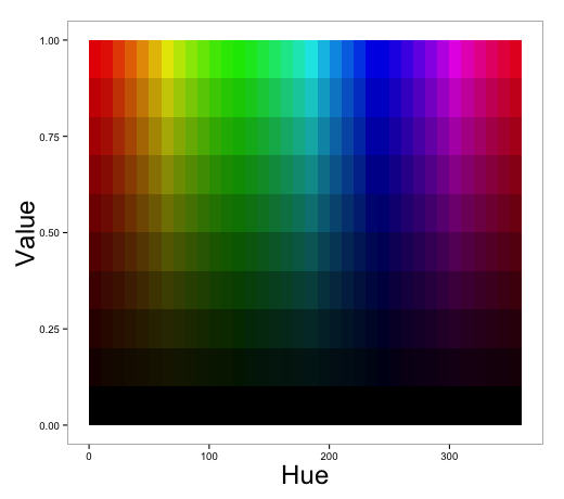
Some people have commented and researched how often those colors appear in movies and movie posters, and so I wanted to take it to the next step and look at the colors used in film trailers. Although I’d like to eventually apply this to films themselves, I used trailers because 1) They’re our first window into what a movie will look like, and 2) they’re easy to get (legally). So I’ve downloaded all the trailers available on the-numbers.com, 312 in total – not a complete set, but the selection looks random enough – and I’ve sampled across all the frames of these trailers to extract their Hue, Saturation, and Value. If you’re new to those terms, the chart below should make it clear enough: Hue is the color, Value is the distance from black, (and saturation, not shown, is the color intensity).

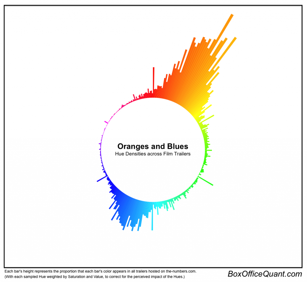
After sampling, I created the chart below to represent the distribution of those colors, so we could truly see how often they appear. I’ve weighted each pixel by the length of the trailer (so longer trailers aren’t overrepresented), and by the value and saturation (because even if the Hue is red, if the value is so low that it’s nearly black, then we don’t perceive much red being there), and so each bar below represents the prevalence of that bar’s color.

This chart makes it visually clear that the oranges and blues truly dominate movie trailers, and which shades exactly are represented. It’s also worth noting that of this graphic is just a histogram, which is a common chart in statistics to measure probabilities, but usually has more function than form. Below, I wanted to dive a little deeper into individual film trailers, displaying their average Hues and Values, their individual spectra, and the distributions of reds, greens, and blues. Scroll over each dot for the film title, and click for more information.

Finally, I wanted to note that this post began as a project for a class in Machine Learning along with my very talented classmate, Qinghui Ji. For the project, we sampled data from trailers to see if movie genre is predictable from colors, subtitles, and face recognition. And our results can be found here, for anyone curious about a more intensive look at the information contained in trailers.

Notes:

All trailers are from the-numbers.com, the Python OpenCV package was used to decode the videos, and the charts were made with ggplot2 and Protovis.

Six Degrees

by Edmund on May 26, 2011

In 1929, Karinthy Frigyes coined the idea that any person is connected to any other within five connections, which became known as the rule of “six degrees of separation.” In 1994, Craig Fass, Brian Turtle, and Mike Ginelli turned the concept from an abstract idea into a trivia game called The Six Degrees of Kevin Bacon Game, where the object was to see how quickly you could connect any actor to Kevin Bacon, through mutual films.

The Game is an entertaining novelty, but it’s also a proof of Frigyes’ original concept, and I thought it would be interesting to put it to a visual test. So I’ve collected all of the films in which Bacon’s been a major actor, then all of the major actors from those films … and so on, for six degrees. In total, this returns a huge 8,430 films and 15,079 actors. Below, I’ve trimmed the list to the top 2,000 (plus Bacon himself), and created an interactive map so you can see for yourself:

Notes: The data are from The-numbers.com, who helpfully trim minor roles out of their cast lists, but will also lead to different numbers than sources based on IMDB. Because of the limitations of the visualization method, I trimmed the data set to 2,001 nodes so that it could still run smoothly. The trimming removed cast and films by keeping the ones with the most connections – so Moon, for example, would be cut because of its sparse cast list. Further, no nodes were repeated – so while Natalie Portman was in Star Wars: Episode II as well as New York, I Love You, she’s only appears the visualization once.

To see more information on Kevin Bacon numbers, make sure to check out The Oracle of Bacon, which can provide the fastest link between any two actors, as well as additional statistics.

Post image for Films for All Seasons

Films for All Seasons

by Edmund on April 3, 2011

“When Chekhov saw the long winter, he saw a winter bleak and dark and bereft of hope. Yet we know that winter is just another step in the cycle of life.” – Phil Conners, Groundhog Day

As a moviegoer and native Californian, I don’t mark the seasons by sun and snow, but by superhero/disaster and Oscar-bait release schedules. The regular patterns of the next Iron Man and Harry Potter are as good as clockwork, and the Star Wars openings were a more reliable predictor of springtime than Punxatawny Phil.

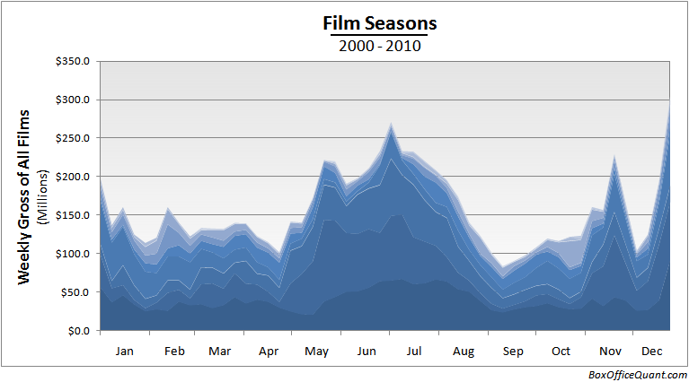
Any film fan intuitively expects this calendar, but what does it look like when you visualize the data? Below is a chart of box office grosses over the course of the year (the weekly domestic averages from 2000-2010):

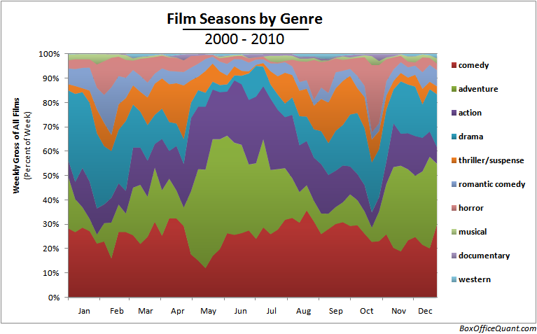
As expected, you can see the summer peak and the smaller, but more concentrated peak in winter. But this chart itself only tells part of the story. If you look closely, I’ve added small color gradients above to represent different genres. Each shade represents a single genre, and you can start to make out how each of these genres waxes and wanes themselves. To look at that breakdown further, below are same data, but color-coded and with a relative scale so you can see the share of each week by the genres.

Or, separated into a 3D area chart (the vertical axis has been removed because interpretation on a 3D scale is difficult, and only the relative scale is relevant):

In the 3D chart, you can see that the summer months are indeed the biggest time of year on average, but not for all genres. Action, comedy, and adventure films all have large summer grosses, but the other genres are far more spread out. And the winter months, action severely drops off while drama, comedy, and adventure take over. Finally, what I think is the most interesting visual is how thrillers and horrors appear to fill in the gaps between the other genres, taking over between winters and summers.

Notes: Data taken from The-Numbers.com. I combined some of their listed genres according to my own discretion: “comedy” is a sum of their listed “comedy” and “black comedy” listings; and “musical” takings include “musical,” “concert,” and “concert/performance.”

Post image for 100 Years of Set Locations

100 Years of Set Locations

by Edmund on March 11, 2011

A few years ago, my sister convinced me to see a film she’d just watched, called The Fall. Within minutes of popping in the Blu-ray, I was hooked; I couldn’t look away. The film follows five characters wandering the globe, and it transports you from the Namibian Desert to the rice terraces of Bali to Prague’s Charles Bridge as effortlessly as most films pan left. One fan’s even devoted an entire blog to covering the locations. And in a world where 127 Hours and Buried can compete for minimalist sets, I always love to see a film that instead embodies exploration. So after watching, I immediately headed to IMDB to see a full list of set locations, and wasted a day looking up every one.

Recently, I’ve found myself seeking this information more often, out of my personal and local interest. And so to make this easier, I’ve taken the top 2000 films from 1910-2010 according to IMDB, and fed their locations into the Google Map below. You can browse in the window below or click the “full screen” link to see a larger version. The map starts zoomed out to get the big picture, but zoom in, click on each marker for more information, and enjoy exploring for yourself:

Full Screen

Notes: To accomplish this, I used Google’s new data management tool: Fusion Tables. I was completely amazed by their functionality; all I needed to do was enter in the location data from IMDB, and the map was generated automatically. These data were taken from imdb.com, as linked in the map, and the 2000 films were selected as the top films from 1910-2010 by most IMDB user votes, as I believed that was the best simple approximation of general interest in each film. Some locations couldn’t be found by Google Maps – and in what has to be the most entertaining error handling I’ve seen, those data points are mapped to the Bermuda Triangle. And finally, The Fall actually isn’t in the top 2000 film list, so after adding that, the totals are 2001 films, and 9736 locations.

Every Sunday, each film studio estimates and reports their weekend box office results. On Monday, they announce the actual results. And in between, hundreds of newspapers, trade magazines, and online posts are written about the weekend’s box office winners. Movie studios care about these stories because many people presumably follow the “wisdom of crowds.” In other words, people may hear about a blockbuster and think: “If so many others saw this movie, maybe I should too.” In addition, movie studios often use opening weekend box office numbers in their advertising for the following week (e.g. “See the #1 movie in America”). Consequently, studios have an incentive to overestimate their Sunday expectations. So a little over a month ago, Neil Malhotra, an associate professor at the University of Pennsylvania, suggested that he and I look at the differences between those predictions and the reality.

We began by collecting data on first weekend “estimates” and “actuals” for the 1,064 movies that opened between 2003 and 2010 in at least 1,000 theaters. The first test we performed was simply to see if the estimates were accurate. If Sunday estimates were not biased upwards, then on average the estimates would be above the actuals as often as below. However, there were more than twice as many overestimates as underestimates (716 to 349), which is highly unlikely to be due to chance alone. To put this in context, this is about as likely as flipping a coin 98 times and seeing only heads, which means that studios are consistently overestimating. On average, studio estimates for Sunday revenues were higher than the actuals by 6.38%. But interestingly, the amount of inflation varies depending on several factors, including the newness of the film being estimated. Below, we plot the average inflations over all films’ first five opening weekends.

You can see that the opening weekend has a vastly higher inflation than the following weekends. This leads to two plausible theories: 1) There’s much more press about opening-weekend results than other weekends, so studios have more reason to inflate the first weekend than following weekends, or 2) The first weekend is inherently the least predictable, and in cases of uncertainty, studios always choose to go with optimistic numbers.

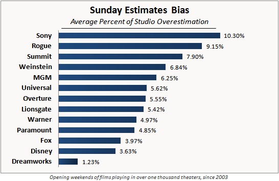
From here, Neil and I wanted to see a breakdown of inflation by studios. Among only the opening weekends, we found the following results:

From this chart, it becomes immediately clear that there is great variation in the inflation levels across studios. Sony is the biggest inflator of the large studios, with an average Sunday inflation of over 10%, with Rogue Pictures close in second. We should also mention that Dreamworks’ and Weinstein’s inflations are within the margin of error, and not statistically distinguishable from zero inflation.

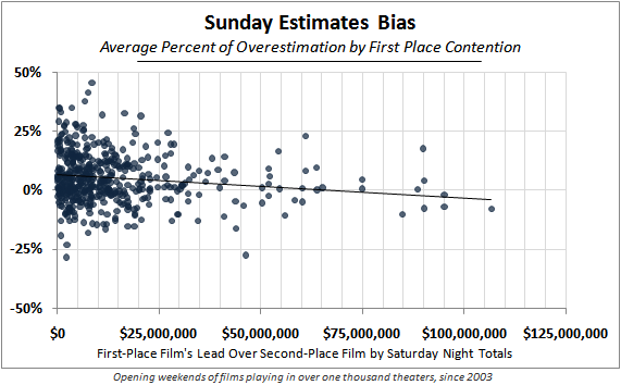
Finally, Neil and I wanted to test the theory that studios would inflate their estimates to achieve a #1 ranking and accordingly generate better press. To examine this, we started with the revenue difference between the top film and the second film at the end of each Saturday (i.e. the two films contending for the #1 ranking). Then we compared that to the inflation. The idea is that we should see a negative relationship; in cases where two films are really closely fighting for first place, studios would have more incentive to inflate than in cases where the result is a foregone conclusion. Here are the results visually:

As you can see above, we do see a decline in bias as the contention amount increases. The line in the center of the chart represents the regression line, with a slope of just under -0.1% per each million dollars. That is, according to the data, a perfectly even race for first place would result in an average bias (for both the first and second place films) of 6.6%, while a $50M discrepancy between the two leaders would result in an average bias of 1.6% – which conforms exactly with our theory that studios are more likely to inflate their numbers when it grants (or sustains) a first place ranking. However, only a small portion of the variation in results is explained by this theory, which leads us to believe that there are still remaining and unknown factors at work.

Notes: Neil and I restricted the analysis to films with more than 1,000 theaters showing the film, as it’s unreasonable to expect accurate estimation in smaller releases. All numbers presented only reflect the difference between Sunday estimates and Sunday actuals, factoring out the Friday and Saturday results (from published dailies), since those are already known at the time of estimation. All data are from Box Office Mojo, checked against the-numbers.com when possible.

Post image for The Value of an Oscar

The Value of an Oscar

by Edmund on February 27, 2011

(January 21, 2013 edit: For a more recent update on the numbers, see this article.)

In the race for the 1998 Best Picture Academy Award, $15 Million was spent to promote Shakespeare in Love - and it was catapulted to victory against Saving Private Ryan, Life is Beautiful, The Thin Red Line, and Elizabeth. Since then, the advertising gauntlet has been thrown down, and the Oscar race has been infused with hundreds of millions in advertising, with an estimated $10-15 Million spent per film with multiple nominees. But is it worth the cost? How much is an Academy Award actually worth?

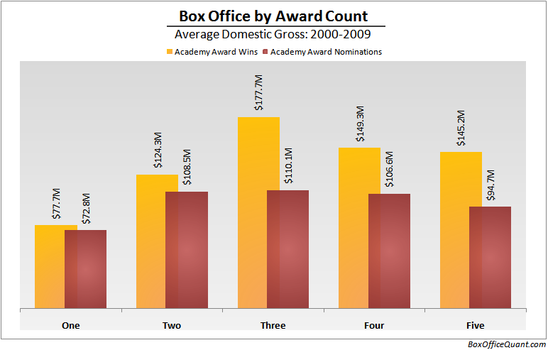
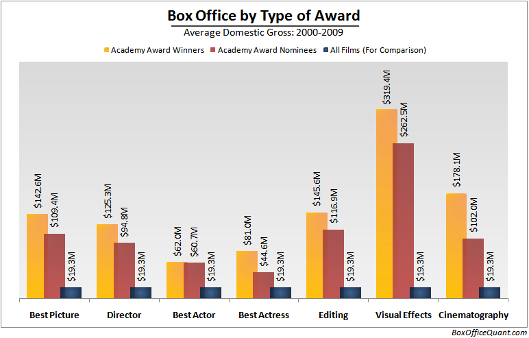
To answer the question, I’ll first breakdown the differences between Oscar winners, nominees, and the average film. Oscar contenders are, by their nature, the cream of the film crop, and that’s reflected in their numbers. While the average film released in the US from 2000-2009 made roughly $19M domestically, the average film with at least one Oscar nomination made $73M, the average film with a Best Picture nomination made $109M, and the average Best Picture winner made $143M. Below are the different results by number of Academy Award nominations and Academy Award wins.

I continued this analysis by studying the box office returns based on the type of award:

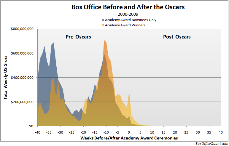
But it isn’t fair to conclude an Oscar is worth any of these amounts. A Beautiful Mind passed the $150M mark before it took Best Picture of 2001. Spiderman II grossed all of its domestic $374M before Oscars were even announced. The Oscar, in these cases, was more a reflection of successful films than the cause. To see this, I’ve taken every film nominated for an Academy Award, separated them based on whether they received a win or not, and overlaid their weekly box office returns based on the time of that year’s award ceremony.

Here we can see a few things about Oscar-nominated films. The most obvious lesson from the chart is that almost all revenues of Oscar-nominated films comes before the awards ceremonies, which isn’t altogether surprising. But what’s much more interesting is the difference between award-winners and nominee-only films on the right half. While they’re roughly equivalent on the left, the right side is completely dominated by Oscar Winners, which is our first indication that Oscar wins are actually valuable in themselves.

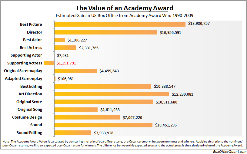
To further that analysis, I wanted to find out the real value of the “Oscar bump,” or just how much more money an Oscar-winning film makes after the ceremonies, compared to a film receiving a nomination-only. I could just report the average difference between winners and nominees-only; but that would still be misleading. Oscar winners tend to make more money than nominees-only before the awards, so it would be normal to expect the winners to continue to make more afterwards (even if there were no value added from the award itself). So to factor out this effect: I have calculated that expected box office result – as if the winners and nominees-only continued to earn the same proportional returns – and then found the difference between the actual box office revenue and the expected revenue. That difference is the “bump.” It represents how much films truly gain in the domestic market thanks to the Oscar brand itself. I also expanded the data back to 1990 for this analysis, for more accuracy. I’ll let the results speak for themselves:

Notes: All data are from Box Office Mojo. The Visual Effects, Makeup, Documentary Feature, and Cinematography categories were not reported in the final chart because on the winners and nominee-only films in these categories had been released on significantly different timelines, which would bias results. Other Oscar categories not reported because of lack of data in US domestic box office.

The Polar Express - 2004's 3D Revival

The Rise of 3D

by Edmund on January 26, 2011

On October 6, 1927, the Jazz Singer debuted – and for the first time in history, film was given a voice. Less than two years later, in July of 1929, On With The Show added color. After these landmark films, cinema had irrevocably changed, and the adaptation of the new technologies was relatively swift. But on April 9, 1953, Man in the Dark became the first major 3D release, and the reaction was somewhat less impressive. If 3D is the way cinema ends, as many critics contest, Man in the Dark came with a whimper and not a bang: critics found no consensus, and until half a century later, our embrace of 3D films had been tentative at best.

Last August, Slate ran a piece entitled “Is 3-D Dead in the Water?” Two days ago, Roger Ebert declared that “3D doesn’t work and never will. Case Closed.” And since the Polar Express delivered us into an era of 3D revival in 2004, critics have been popularly proclaiming 3D as a dead medium walking. But what do the numbers show? Well, it appears the demise of 3D has been somewhat exaggerated.

Let’s start with the recent state of 3D: Until 2008, the US revenue from films that were offered in 3D never accounted for more than 3% of all films. In 2009, they represented 16.3%, and in 2010, 31.4%. Keep in mind, those numbers include 2D versions of 3D films, such as the 2D screen revenue from Avatar. But even if that’s factored out, in 2010 the revenue from 3D-only was still 20.2%. To understand this trend visually, I’ve made two charts that show the rise in revenue from 3D-only screenings. Here’s a monthly breakdown from 2000-2010:

For a closer look, I’ve also created a weekly chart representing the last 3 years. It’s much easier to understand the granularity in this version, as you can track how individual 3D films are introduced, and how their revenue slowly decays:
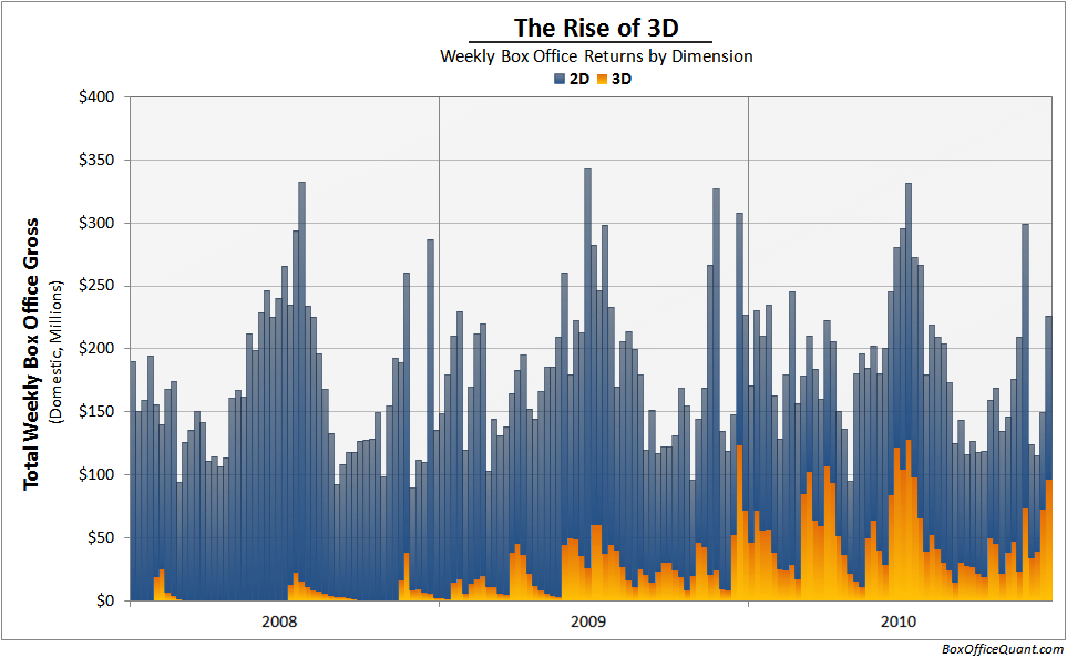
From that perspective, 3D isn’t dead – in fact, it appears to be thriving. But this is only a snapshot of the moving industry, and only half the story.

To dive deeper, the previously mentioned Slate article did some insightful research on the per-theater revenue of 3D compared to 2D. Their results were that after 2004, 3D revenues per theater have been approaching 2D revenues, and that they’re now about equalized. Essentially, Slate has shown that 3D theaters previously were routinely filled with a larger audience, but that now audiences demand a 3D theater no more than 2D. This is a sign that the 3D market has matured, and the use of 3D theaters has been saturated. According to this analysis, any future rise in 3D as a share of all films can’t come simply from the novelty of 3D, but from a better use of 3D in films, or audiences becoming more accustomed to unwieldy polarizing glasses. And so, although the Slate article does make a convincing case for a deceleration of 3D film, I don’t believe it indicates that 3D film is likely to decline.

To further this analysis, I wanted to shed some light on the broader picture, and answer the larger question: how profitable are 3D films? Below are two charts: the first comparing the production costs to worldwide gross (in all films that have published production budget data from 2000-2010), the second showing returns to production budget over time.

First of all, the wayward dot in the top right is, of course, Avatar. Otherwise, as you can see, 3D films generally make much more money than 2D ($381M compared to $89.5M); but also cost much more ($105M compared to $35.6M). For each dollar spent on a 3D film, there’s an average return of $3.69; and for each dollar on a 2D film, there’s an average return of $2.51 in worldwide box office revenue.

However, given the high unpredictability of box office returns, this difference is statistically insignificant (there’s over a 20% likelihood that this differential return is the result of random chance). In addition, there is a bias in which films publicly report their production budgets, and this chart doesn’t speak to the fact that many films are selected for 3D treatment after having already been predicted for higher success. However, this information does strongly indicate that 3D films are not faring significantly worse than 2D, and any reasonable guess for the future, has to guess that 3D will be a growing factor in cinema.

Lastly, I wanted to understand the development of 3D profits over time. In the chart below I’ve studied the return on production budgets – the amount earned worldwide divided by the amount spent in production. (Note the logarithmic scale, to fit in huge outliers such as Paranormal Activity and Super Size Me):
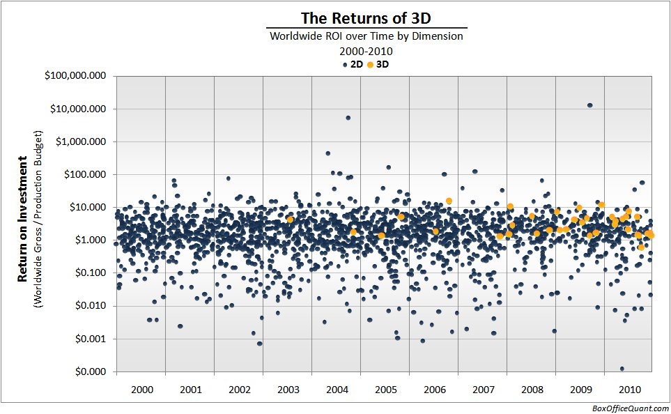
This final chart shows that 3D films are continuing to offer as much profit as ever; and their returns to production budget have actually remained remarkably constant (averaging less than a 0.1 cent change per year). In addition, you can see that all the 3D films have been much more predictable than 2D films. Where 2D films vary all over the map, 3D films (largely due to their big budgets) always give about the same return on investment, making them less risky, and even more desirable.

In the end, The Polar Express wasn’t the latest Jazz Singer. 3D isn’t the natural progression from 2D that only took time and technology to overcome. I believe it’s best considered a nearly different medium altogether, requiring a whole new set of tools to create well, and a new set of rules to evaluate and appreciate. In fact, I think the most apt comparison is that 3D, as it is now, is like the Silver Age of Disney: animation after The Lion King. We’ve seen the wonders of the new format (as well as some horrors), and the novelty is just now wearing off. But at the same time, even if each film is no longer quite as special, and there are as many misses as hits, the format is still in its newfound infancy – with a long way to mature.

Notes: The revenue from 3D was calculated by multiplying a film’s total revenue by that film’s share of revenue from 3D. However, the 3D share data are spotty – so when the data were unavailable, I assumed an average share for each film in 2010 so that the resulting weighted average of all films matched the reported 2010 average of 62.22%. In years previous to 2010, I assumed 62.22% where data were missing.

Statistical significance of 3D vs. 2D ROI based on a t-test of ROIs by dimension; the p-value is 0.22. ROI calculations were averages of ROI weighted by world gross, which is equivalent to dividing the sum of world gross by the sum of production budgets, for each dimension.

Revenues and production budgets from the-numbers.com. List of 3D films from boxofficemojo.com. Other sources: 1234567,8910.

Dark City

The Genre Codex

by Edmund on January 18, 2011

What defines a genre? If an Action film is large enough, when does it become an Epic? Is No Country for Old Men a Mystery or a modern Western? Is there any value at all to try to classify Being John Malkovich?

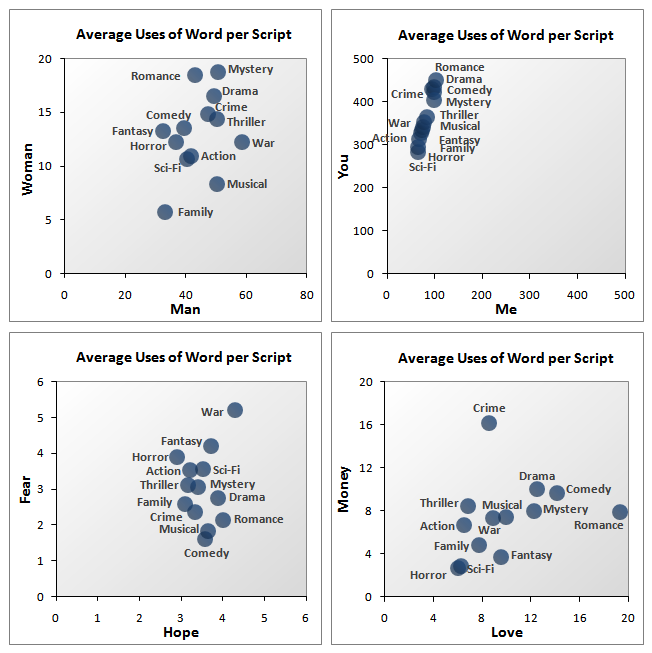
Thanks to The Internet Movie Script Database, I can start to answer a piece of that question: what words constitute the text of each genre. The database contains 897 scripts over 13 categories, not enough for a comprehensive understanding of film scripts, but more than enough to look at some basic insights. So the first thing I wanted to see was a simple count of word frequencies by genre: how many times the word “love” appeared in Romance compared to how many times the word “money” appeared in Crime. The results are below:

Word Frequency

Most of these results are unsurprising: “Woman” is used the most in Romance, “Man” in War. “Hope” and “Fear” are both the most prevalent in War. And, as mentioned, Crime seems to be the most about “Money,” Romance about “Love.” But some results were less obvious: If you look at the scale of the top left chart, it seems that there’s still a gender gap in Hollywood pronouns.

The Codex

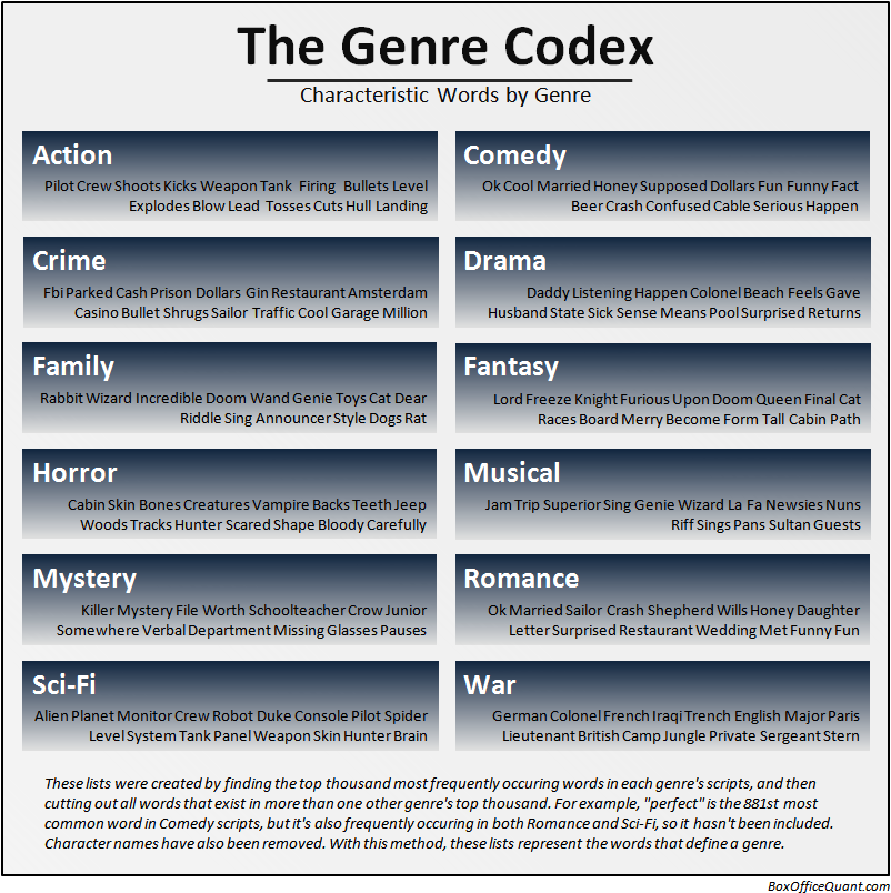
After simple word counts, I wanted to look at something I found more interesting: the “characteristic” words of each genre. I wanted to find small groups of words that, if you read in any script, would immediately tell you what genre you’re in. For example, if you heard the line “Commander of the Armies of the North, General of the Felix Legions…” you know without a doubt, that you’re watching a War Epic, even if you’ve never seen Gladiator. To find this kind of list, you don’t just use the most frequently used words, but the most frequently used words that are not used in other genres. Below are the results and methodology.

Genre Wheels

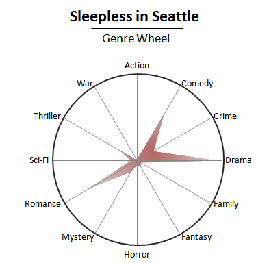
Finally, I wanted to use both of the above tricks and reverse them. That is, I’ve taken all the words in the Codex, and counted their use in each genre. With this information, I’ve constructed a simple model that can take a script and predict that script’s genre. To represent the results, I’ve created what I’m calling “Genre Wheels,” which are charts that indicate exactly how much each script is an Action film, or a Romance, or a War, etc. For example:

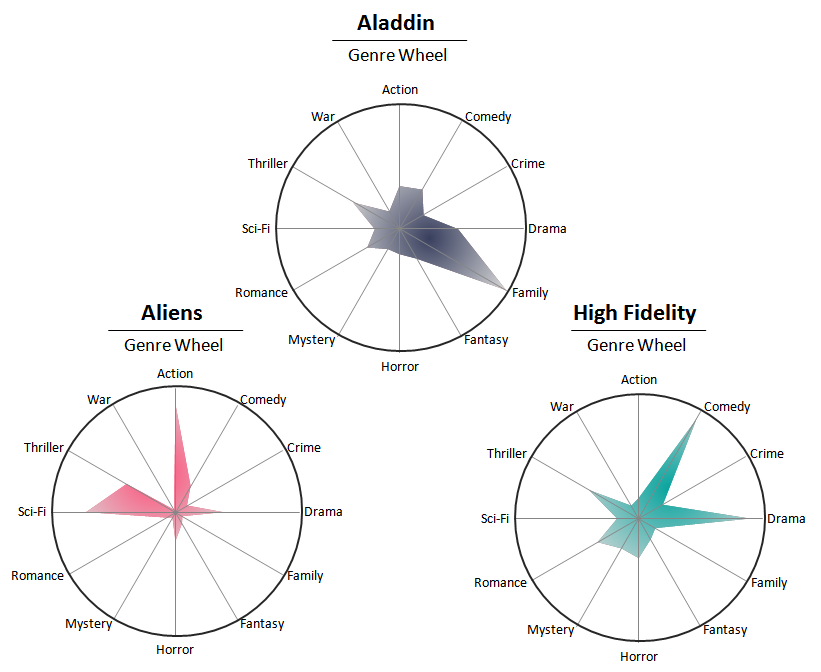
The chart shows that based on the script of Sleepless in Seattle, it’s mostly a Romance and a Drama, but also a bit of a Comedy – in this case, the Codex has predicted genre exceptionally well. Here are a few more examples:

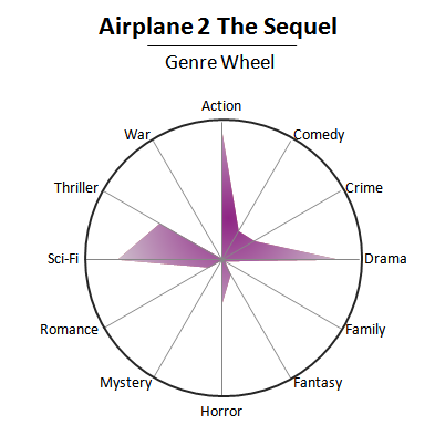
However, genre is a complex construction, built from far more than just the words of a film, and 897 scripts aren’t enough to even completely inform each genre’s word choice – so some results are less than perfect:

Ultimately, these results aren’t accurate enough to take as more than entertaining glimpses into what a script can tell you about a genre. Below are 150 randomly selected maps, and you can see them all on this page.

Notes:
As mentioned, the scripts and the genre categorization area all from imsdb.com. It’s not nearly a complete list of every script written, and each script ranges from first draft to final cut. Finally, genre categorization is always a judgment call, and I left the categories as they were presented.

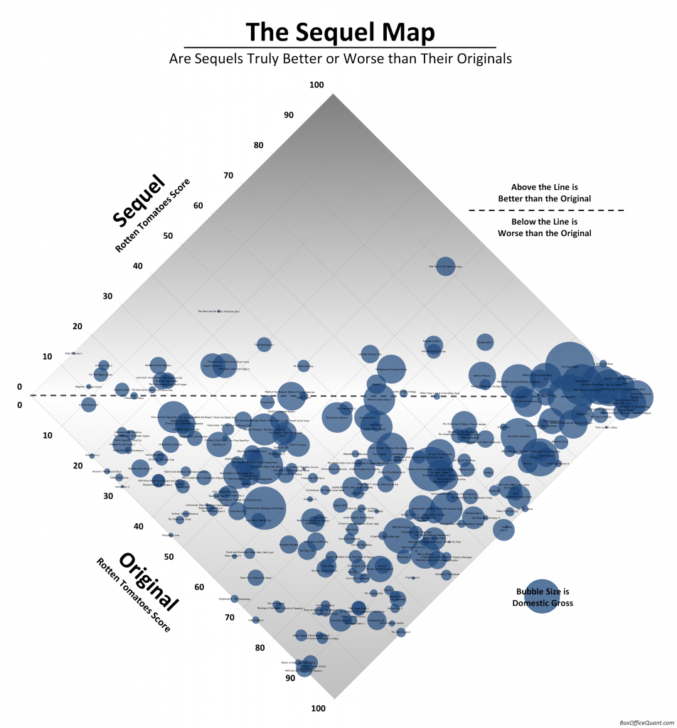
After Shakespeare penned Henry VI, Part 3, do you think anyone complained that Renaissance England had run out of original ideas? I’m not sure, but I can guarantee that anyone who’s seen Weekend at Bernie’s II wishes that most sequels hadn’t been made.

There are exceptions – Godfather II hit harder than the original. The Dark Knight took the start of Batman Begins and made it into either the most thoughtful action movie of all time, or the fasted-paced thoughtful movie of all time (at least until Inception) – but, sadly, far more films fit the rule – and more sequels fail to surpass their original work.

As evidence, all sequels with Rotten Tomatoes scores have been categorized below, with the originals’ scores on the X-axis, and the sequels’ scores on the Y. Films at the center line are sequels with the exact rating as the original; films above are sequels that have surpassed the original; films below, ones that fared worse.

Notes: Categorization of sequels is sometimes more art than science, so I’ve had to follow a few rules: I’ve only included the second film in any series, never third or following films. I haven’t included remakes or “reboots,” and I’m only presenting films which opened (at some time) in the US and have Rotten Tomatoes ratings.

And finally, it’s worth noting that the only two film/sequel combos to both score 100%, are the first two Toy Storys and the French films Jean de Florette / Manon des Sources.

Rotten Tomatoes ratings from RottenTomatoes.com. US Gross from www.the-numbers.com.

Post image for The Magic of Pixar

The Magic of Pixar

by Edmund on October 8, 2010

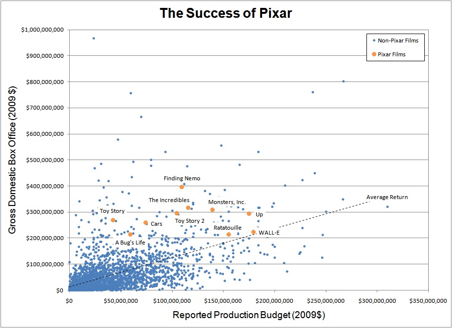
The existence of Pixar marks one of the remarkable points in human history in which the greatest works of art are also the most commercially successful. It has happened before: with Shakespeare, J.S. Bach, Michaelangelo, The Beatles. But throughout the modern course of our pop-ridden lives, it surely seems the exception more than the rule: Jersey Shore, Britney Spears, Michael Bay, to name too many.

I don’t know how history will treat cinema as an art form, either hold it to the standard we now hold canvas painting, or ridicule it as passing pulp. I do know Transformers will never be watched in a classroom in a century. And I hope no one will write a book about how a Dumb and Dumber sequel came to pass. But the beauty of 2001, the mystery of Vertigo, the insanity of It’s a Mad, Mad, Mad, Mad World – I believe these have lasting appeal. And Pixar has potential to be the greatest of all figures in this pantheon of filmmakers: every one of their movies has been good or great. Some better than others. Some favorites and less favorites. You might love most the dystopian slant of WALL-E, the humor of the Incredibles, or the score of Up – but if you’ve seen any Pixar film, I’d wager you love something.

And the amazing part is that they’re appreciated in their time. Below are films since 1980, comparing their domestic gross to their reported production budget. The line represents the average (the regression line), and Pixar has beaten the average every single time – a feat no other studio has come close to matching:

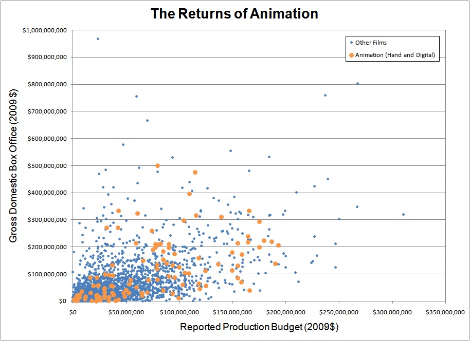
And in case you believe that animation, in general, is more successful, I’ve provided a second chart. As evident here, animation is no more likely than live-action films to have a high return on investment (in domestic markets):

Notes on the data: both axes are inflation adjusted (according to the CPI, rather than ticket prices), and all numbers are courtesy of the-numbers.com.